What we made
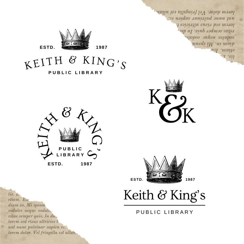
- Logo, crest and monogram
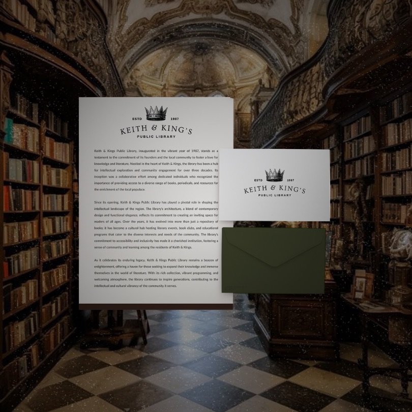
- Letterhead
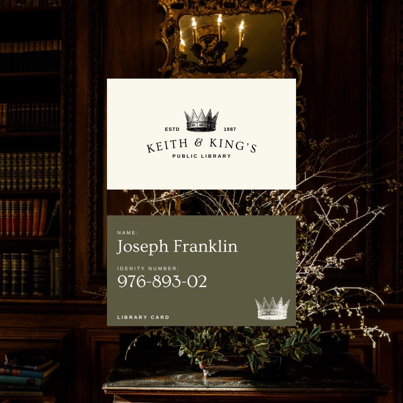
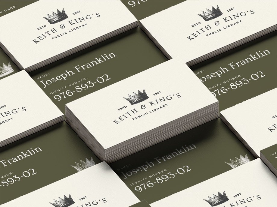
- Business cards and staff cards
- Signage direction
Overview
Keith & King’s is a concept for a historic public library. We wanted to honor its heritage while making it feel welcoming to new readers.
The identity
A crown and an elegant serif ampersand monogram give the library a timeless, storied character. Dark wood tones, cream paper and library photography set the mood.
About this project
This is a self-initiated brand concept, created to explore how a public library brand could look and feel. It was not commissioned by a real client.
Gallery